Netrality Content Syndication Document
Document/Layout design


Layout & Design system
Role: Designer, Illustrator
Design Direction: Natalie Ferro
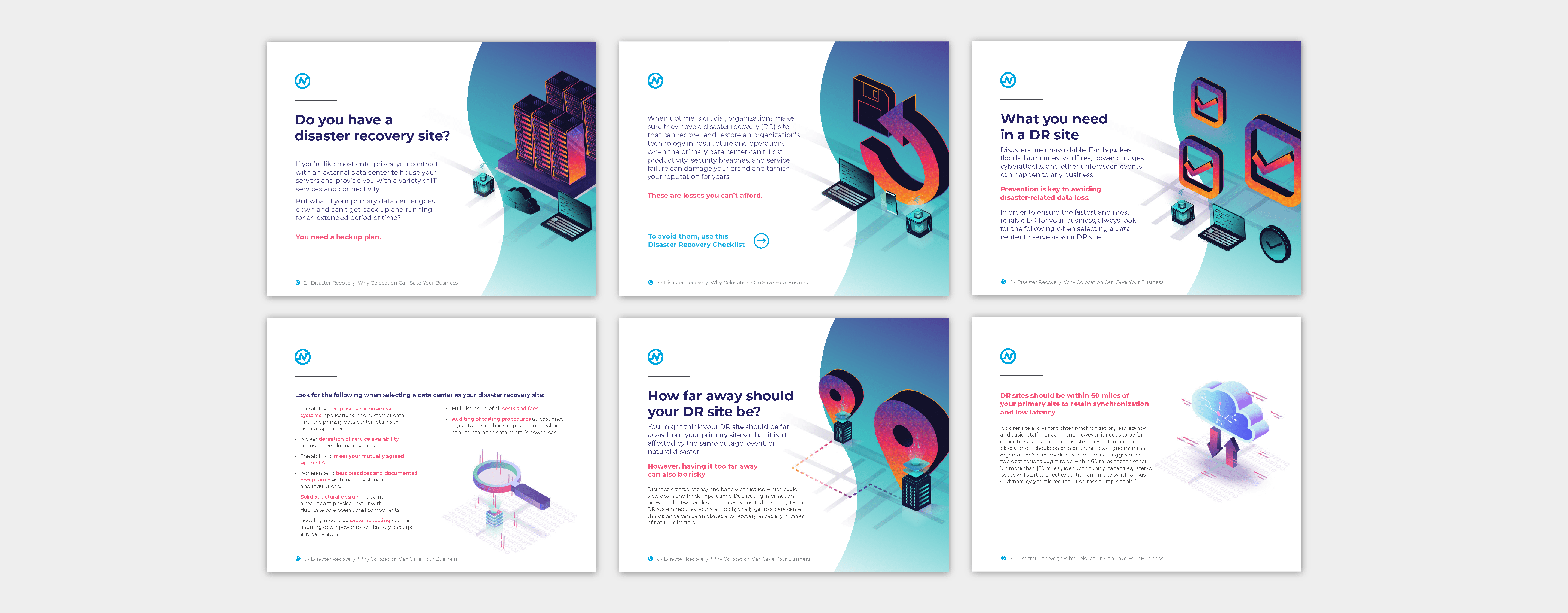
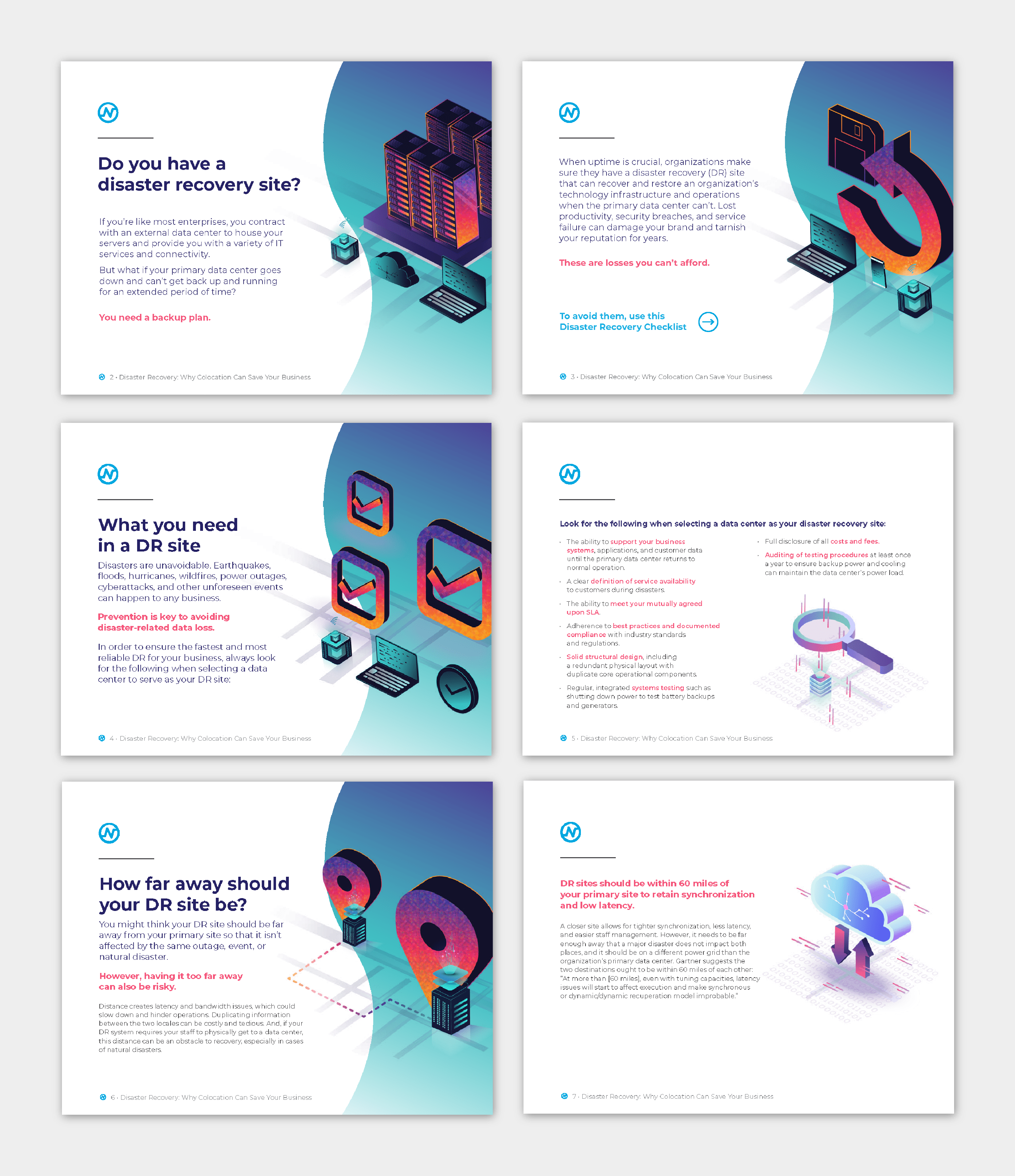
This document was designed as a digital asset that extends the Netrality brand. The client asked that the asset be taken in a brighter, more white-space oriented direction, in contrast to deeper purples that had been more prominent in the brand prior (example top left). I combined illustration elements previously used in the brand with a new gradient to keep the asset bright (bottom right). Another important piece to this design was the system for the hierarchy of text in the document. Introduction pages feature more monumental illustrations on the bright gradient, while non-introduction interiors feature a secondary level of illustration.