Wavefront by VMware
visual design for digital and print

While working at Scratch, I designed some marketing collateral for Wavefront by VMware.
Designing for Cohesion
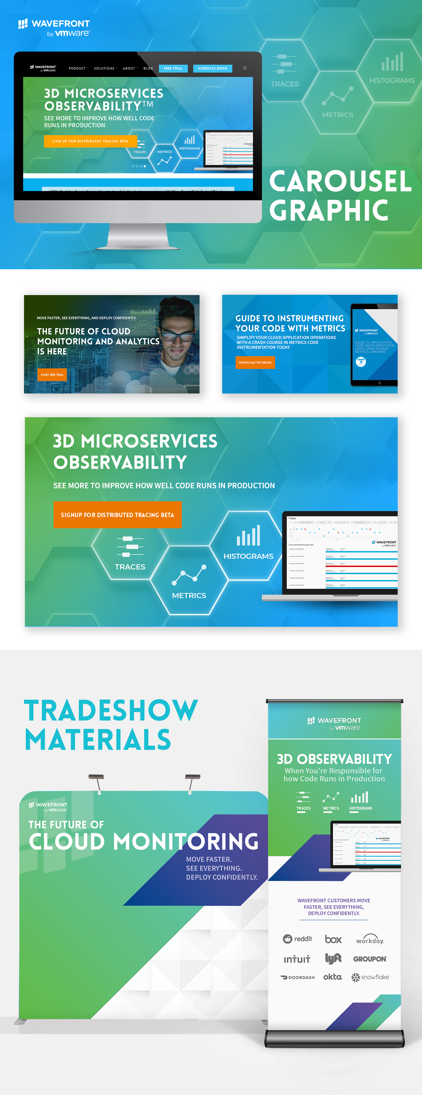
When I was brought on to designing carousel images for Wavefront, some of the other carousel images had already been created and approved by team members. The final graphic which I designed needed to have a look that matched the other designs, so I took the idea of the blue-green gradient from one image and the idea of a geometric background from another image to create a new graphic that fit into the family.
A Bright Extension
The client liked the brightness of the carousel graphic and wanted to create a vibrant banner and backdrop for a tradeshow. I extended the blue-green gradient and added some purple elements to add visual interest and pop to the design. I also took out the hexagonal background pattern to help legibility of the design since people would need to be able to read the banner and backdrop from a distance.